Google has given its official app for podcasts a significant design refresh. The update started rolling out to beta users on Friday. The changes start on the Home tab, where the podcasts carousel is now called Subscriptions. It allows Google to add a More button that opens a grid view.
Google podcasts have been redesigned based on many tweaks that address usability complaints that users have made to the Mountain View, California-based giant.
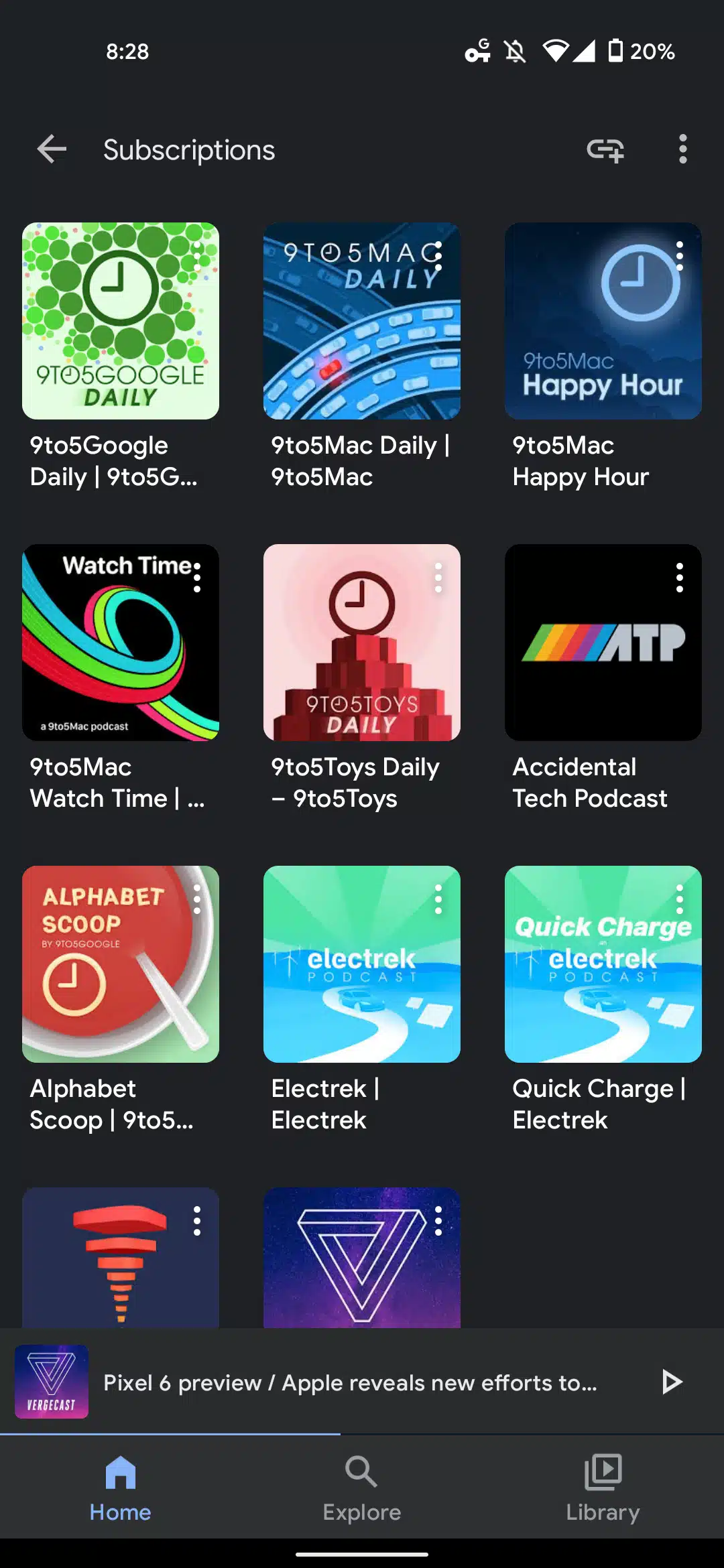
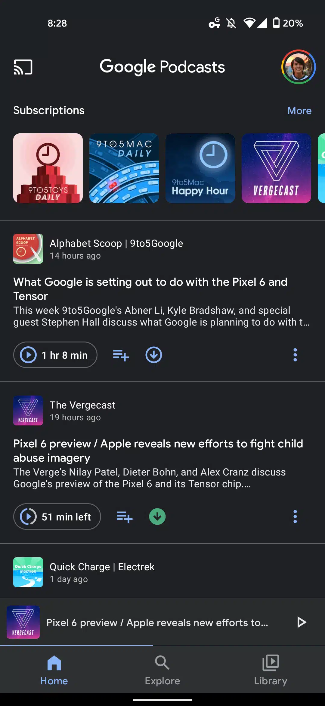
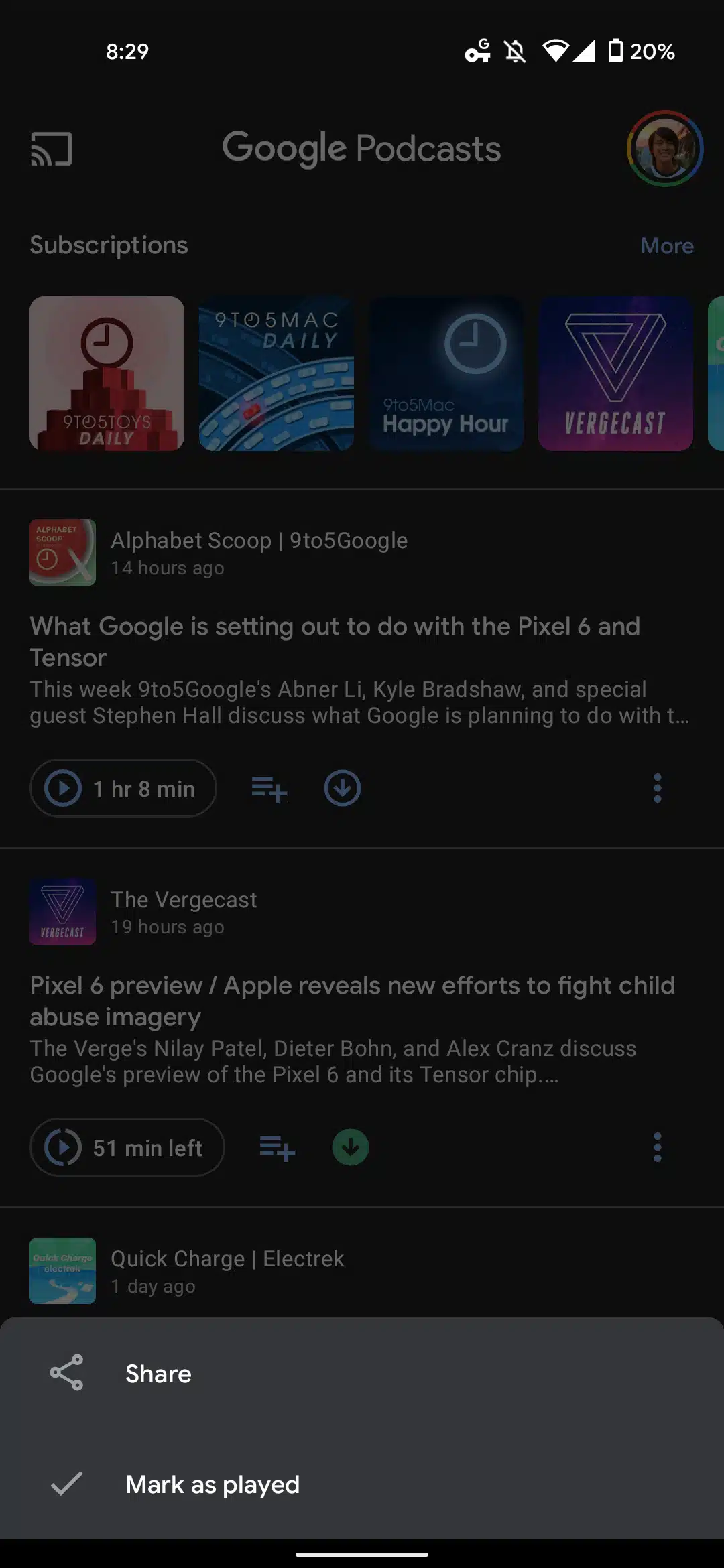
Users had been complaining about the earlier carousel-like layout that required a lot of scrolling to find a particular podcast. The Home tab is similar except for each episode card, adding an overflow menu in the bottom right corner.
It lets you quickly Share or Mark as played. It saves users from having first to open the full episode page to complete the last action. In addition, Explore is not changed, which drops the red “Beta” tag for all users appearing in the app bar, thus avoiding the double “Explore” with the bottom bar.
The Activity tab has now been changed to Library. The four tabs within Activity, including Your Queue, Downloads, History, and Subscriptions, have been removed.
The Google Podcasts app/home screen icon no longer resets users in the app, which took the users to the Home tab. It was due to Podcasts being part of an extension of the Google app. But, now Google Podcasts acts like a separately installed app on your smartphone.
The redesigned Google Podcast Playing UI on iOS now lets you block recommendations. Podcasts for Android users now let you customize recommendations as well. Moreover, the Home feed is unchanged that lets you quickly Share or Mark as played.
It saves users from having first to open the full episode page to complete the last action. The update for Google Podcasts started rolling out to beta users on Friday.